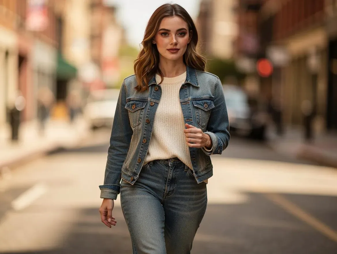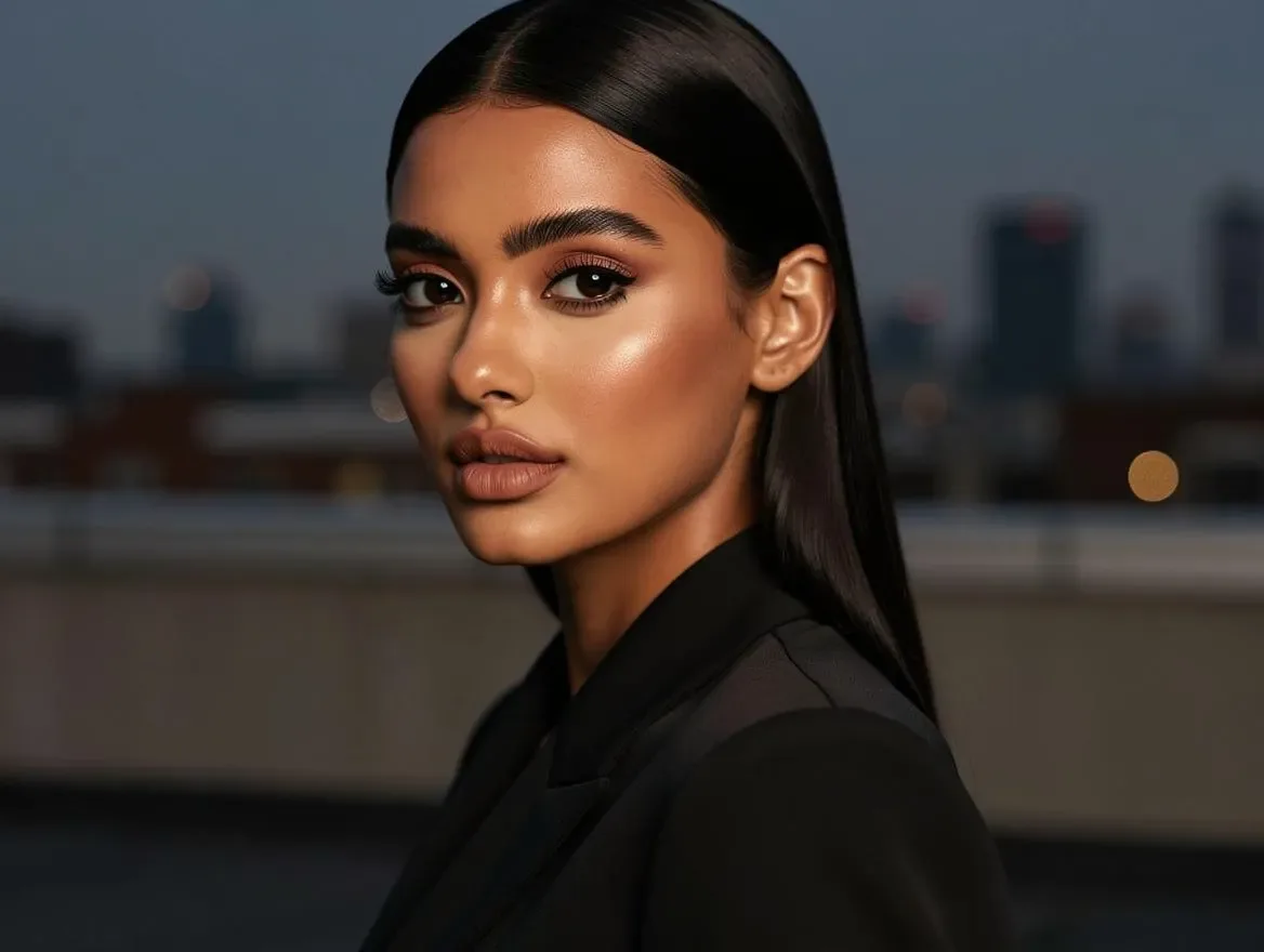
Every colorway a garment ships in doubles its photography bill — that's the traditional rule. Same design, same cut, same styling, but the sage version and the rust version each need their own frames, because shoppers won't buy a color they can't see. Multiply a catalog by four dyeways and the shoot day quietly becomes four.
AI colorway generation breaks that multiplication. You photograph one colorway properly, and generate the rest of the run from it: same framing, same lighting, same drape — different color, with the print and texture intact. Here's how the workflow operates, where it beats manual recoloring, and how to keep the results honest.
Why not just recolor in Photoshop?
Brands have hue-shifted product photos for years, and it fails in predictable ways:
- Prints shift with the base. A hue rotation that turns the navy kurta green also turns its white block-print mint. Masking every print element by hand, per photo, is the tedium you were trying to escape.
- Multicolor designs break. Rotate one channel and every other color in the garment rotates with it.
- Texture flattens. Naive fills lose the weave's shadow detail — recolored areas read as plastic.
- Neutrals are hopeless. Hue math can't turn a black garment white or make a saturated red into a soft beige without destroying the fabric's depth.
AI colorway generation works at the level of garment understanding rather than pixel math: the model recognizes base fabric versus print versus trim, and recolors the target while regenerating the way light interacts with the new dye. A white print on navy stays white on green — because the system knows it's a print, not a region of pixels.
The workflow
1. Start from your best accepted frame. The colorway master should be a finished, reviewed image — typically your strongest on-model PDP frame (see flat-lay to on-model for getting there). Every variant inherits its framing, pose, and lighting, which is precisely the point: a matched set.
2. Target real colors, not vibes. Feed the AI Clothing Colorway Generator the actual production colors — a hex code from your design files or a photo of the dyed swatch from the mill. "A nice green" is how catalogs drift from inventory; a swatch is how they stay honest.
A note on capturing that swatch, because it's the step most brands rush: photograph the dyed fabric in indirect daylight, never under warm indoor bulbs, and fill the frame with the fabric alone. A swatch photo taken under a yellow light bakes that yellowness into every colorway generated from it. If you work from hex codes instead, take them from your design system, not from eyedropping a screen photo — screens add their own cast.
3. Generate the run and inspect each variant like a new image, because it is one:
- Is the base color a faithful match to the swatch — in cloth, not backlit-screen, terms?
- Did the print survive untouched where it should be untouched?
- Did elements that should stay fixed — buttons, zari trim, the model's lipstick — stay fixed?
- Does the fabric still read as itself? A recolor should never change apparent material.
4. Publish as a set. Name files by variant, map each image to its SKU, and let the product page's color swatches switch between genuinely matching photos.
Why matching variant photos matter commercially
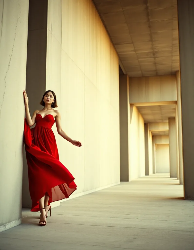
Color variant photography isn't cosmetic — it's conversion infrastructure:
- Swatch-switching builds confidence. When every color shows the same pose and light, the only thing changing is the color — which is exactly the comparison the shopper is trying to make. Mismatched variant photos make that comparison work, and hesitation is where carts die.
- Unphotographed colorways undersell. A variant listed as a text label with no image is asking the customer to imagine the product. Some will; most won't.
- Marketplaces reward completeness. Multi-image, all-variant listings simply present better in feeds and search than single-photo ones.
For print-led categories — lawn being the canonical case, as covered in AI product photography for Pakistani fashion brands — the color run is the whole commercial format. One design in five dyeways photographed once each versus once total is the difference between a shoot week and a morning.
Planning the run like a merchandiser
Cheap variant photography changes which colorways are worth offering, and that's a merchandising decision, not a technical one:
- Photograph the hero dyeway best. Shoot the colorway you expect to lead sales as the master — it gets the real photography care, and every variant inherits its quality.
- Test colors visually before committing dye lots. Because a colorway image now costs credits instead of a sampling cycle, you can view the design in six candidate colors and choose the four that earn production. The image becomes a decision tool upstream of inventory, not just a listing asset downstream of it.
- Keep generated and stocked colorways in sync. The flip side of cheap variants: never publish a color you don't actually stock. The catalog must trail inventory reality, not lead it.
- Name for the swatch, not the whim.
SS26-014-sage.webpmapped to the SKU beats renaming files at midnight before a launch. Variant discipline is file discipline.
Specifying color so the output matches the fabric
"Make it green" is not a specification. The quality of a recolor depends on how precisely you name the target, and there's a simple hierarchy:
- A hex code is the floor. #0F4C4C is unambiguous where "teal" is a debate. Pull it from your design files, or eyedropper it from a photo of the actual dyed swatch — the swatch, not the mill's spec sheet, is what your customer receives.
- A name plus a hex is better than either alone. "Deep Teal (#0F4C4C)" gives the system both the machine-readable target and the human color family, which helps at the ambiguous boundaries — the teals that could drift blue, the maroons that could drift brown.
- A reference swatch photo is the ceiling. For fabrics whose color shifts with weave and sheen — raw silk, chambray, anything slubbed — a photographed swatch captures what a flat hex can't: how the color behaves in light.
Two merchandising habits pay off here. First, standardize your variant names once (Deep Teal, Kashmiri Rose, Mehndi Green) and reuse them across the catalog, the PDP dropdown, and the generated filenames — customers search and filter by these names, and inconsistent naming quietly fragments your own analytics. Second, keep a one-page brand color card: every dyeway you actually produce, with its name, hex, and swatch photo. New collection variants then reference the card instead of re-deciding color language every season, and every future recolor run starts from the same vocabulary.
Edge cases worth knowing
- Colorways that change the print too (navy base/white print → white base/navy print) are a design inversion, not a recolor — generate them as separate references or expect to review harder.
- Iridescent and shot fabrics (two-tone shimmer) are the hardest recolor case; scrutinize results closely.
- Very dark → very light conversions expose shadow detail the reference barely captured; a brighter reference photo helps.
- Dye-lot honesty still applies. The generated variant should match the fabric you ship, not the Pantone you wish the mill had matched. If the physical dye lot came out warmer, target the swatch photo, not the spec.
That last point is the governing principle of the whole technique: a colorway image is a product claim. AI makes accurate variant photography cheap — it doesn't make inaccurate variant photography acceptable.
Beyond the product page
Once the variant set exists, it works harder than a swatch picker:
- Ads: color is the cheapest creative variable to test. Run the same frame in three colorways against the same audience and let the click-through tell you which dyeway leads the campaign.
- Social: a carousel of one design in its full run is a reliably strong post format — it reads as abundance and invites the "which one?" comment that feeds reach.
- Email: segment by past purchase color affinity and lead with the variant each segment actually buys.
- Restock and pre-order pages: show the incoming colorway accurately before inventory lands, so demand can be tested against a faithful image rather than a mood board.
None of that was economical when each color needed its own shoot. At per-image pricing, the color run becomes a content library, not just a listing requirement.
Where it sits in the full pipeline
Colorways slot in as the multiplier at the end of the standard AI catalog flow: flat-lay → on-model conversion → review → color run → export. With saved Brand Models holding the cast constant (the complete guide covers why that consistency matters), one careful photograph becomes an entire product family: every color, every angle, one identity.
Try it on a real color run: create a LensGo account — the free sample shoot (one garment, three images, signup required) covers your reference frame — and generate your first variant set from the design your catalog sells hardest.