Scroll through any travel creator's Instagram feed, and within seconds you can tell whether they have a brand or just a collection of posts. The difference isn't talent or budget — it's consistency. A recognizable travel brand has a cohesive visual identity: a signature color palette, a preferred style of composition, and a mood that runs through every image like a thread. AI image generation makes building this consistency dramatically easier, but only if you approach it with intention.
Why Visual Consistency Matters
Humans are pattern-recognition machines. When someone encounters your content for the first time, they make a split-second judgment about whether your brand is "for them" based almost entirely on visual cues. When they see your content a second and third time, that visual consistency is what triggers recognition — the feeling of "I've seen this creator's work before." Without consistency, every post is a standalone encounter that builds no cumulative equity.
The most successful travel brands on social media — both individuals and companies — have visual identities so distinctive that you could identify their content without seeing a username. This doesn't happen by accident. It happens by deliberately choosing a visual direction and maintaining it across every piece of content.
Defining Your Visual DNA
Your brand's visual identity is built from four core elements: color palette, lighting style, composition preference, and subject focus. Before you generate a single image, spend time defining each one.
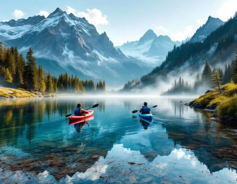
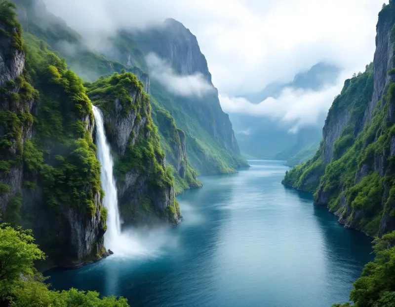
Color palette is the most immediately recognizable element of any visual brand. Some travel creators are known for warm, golden tones that make every destination feel sun-kissed and inviting. Others favor cool, desaturated palettes that give their work a moody, cinematic feel.
Some lean into vivid, saturated colors that pop on screen. There's no wrong choice — what matters is that you choose one direction and commit to it.
In practice, this means encoding your preferred colors into your AI prompts. If your brand identity is warm and golden, every prompt should include phrases like "warm golden light," "amber tones," or "sunset color palette." If you prefer cool minimalism, your prompts should reference "cool blue tones," "soft diffused light," or "muted color palette." Over time, this consistency builds a visual signature that audiences recognize instantly.
Lighting style shapes the mood of your images more than any other single factor. Hard, directional light creates drama and contrast. Soft, diffused light creates warmth and approachability. Backlighting creates silhouettes and atmosphere. Most successful travel brands gravitate toward one or two lighting styles and use them consistently.
Composition preference is about how you arrange elements in the frame. Some brands favor symmetrical, centered compositions that feel orderly and satisfying. Others prefer dynamic, off-center arrangements with strong leading lines. Some use lots of negative space for a minimalist feel; others fill the frame for maximum impact. Define your preference and reflect it in your prompts.
Subject focus is the thematic lane your brand occupies. You might focus on luxury resorts, street food, architecture, nature, adventure, or cultural experiences. The narrower your focus, the more recognizable your brand becomes — but the lane needs to be wide enough to sustain consistent content production.
The Brand Prompt Template
Once you've defined your visual DNA, encode it into a reusable prompt template. This template serves as the foundation for every image you generate, ensuring brand consistency without requiring you to reinvent your style with each prompt.
A luxury travel brand's template might look like: "[Scene description], premium editorial aesthetic, warm golden-hour lighting, soft amber and cream color palette, clean composition with negative space, lifestyle photography, 8K quality." Every prompt starts with this base, and only the scene description changes.
An adventure travel brand's template would look quite different: "[Scene description], documentary-style photography, dramatic natural lighting, rich earth tones and deep greens, dynamic composition with depth layers, raw and authentic feel."
The discipline of using a template for every generation is what separates brands with a cohesive visual identity from accounts that look like a random assortment of AI art. It might feel restrictive at first, but the constraint is what creates recognition.
Evolving Without Losing Identity
Every brand needs to evolve — what felt fresh six months ago can start to feel stale if you never change anything. The key is evolving gradually and deliberately, adjusting one element at a time rather than overhauling your entire visual identity at once.
Think of it like a wardrobe: you can introduce a new accent color without changing your entire style. Try a new composition approach in one out of every five posts. Experiment with a different time of day. Explore a new destination type that stretches your brand slightly without breaking it. These incremental experiments keep your content feeling alive while maintaining the core consistency that makes your brand recognizable.
Pay attention to which experiments resonate with your audience and which don't. Your community will tell you — through engagement, saves, and direct feedback — when an evolution feels natural and when it feels off-brand. Use that feedback to guide your brand's direction over time.
Content Series as Brand Anchors
One powerful technique for building brand recognition is creating recurring content series with consistent visual formatting. A weekly "Hidden Gems" series where every post uses the same composition style and text overlay treatment. A monthly "Destination Deep Dive" that always features a specific sequence of images — aerial view, street level, detail shot, golden hour wide. A "Prompt of the Week" series that teaches your audience about AI generation while showcasing your brand aesthetic.
These series create anticipation and recognition. When your audience sees the visual format, they immediately know what they're about to get, which increases engagement because they've already developed positive associations with the series format. It's the same principle that makes magazine columns and TV show segments work — familiar formatting reduces friction and builds habit.
Measuring Brand Recognition
Brand recognition is harder to measure than engagement metrics, but there are reliable indicators. Look for comments that reference your visual style ("I knew this was your work before I saw your name"), an increasing number of people tagging you in content that reminds them of your style, and — most importantly — brand partnership inquiries that reference your specific aesthetic. When potential partners say "we love your warm, golden style and think it's perfect for our resort," that's brand recognition converting into revenue.
The journey from random posting to recognizable brand doesn't happen overnight, but with the consistency that AI generation enables, it happens faster than you might think. Define your visual DNA, encode it into a prompt template, and commit to consistency. Your brand will emerge.