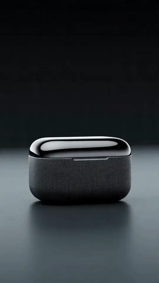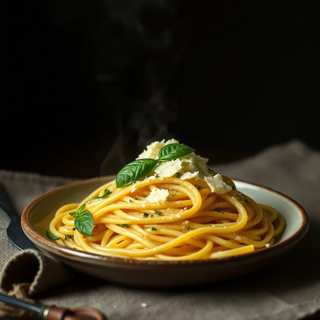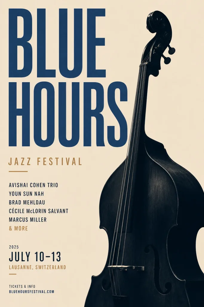
Not every visual is a single hero image. A carousel has to feel like one continuous story across slides. A thumbnail has to punch at 120 pixels wide. A poster lives or dies on text hierarchy and letter-perfect spelling. Each is a different craft — and Iris has a skill tuned for each one, so you get the format's rules for free instead of fighting them by hand.
Carousels: consistency is the whole game
The failure mode of an AI carousel is obvious the moment you swipe: every slide looks like it came from a different artist. The Carousel skill fixes that by keeping the style, palette and lighting consistent across slides while only the subject and composition change. You brief the story arc — hook, then development, then payoff — and it maps one slide per beat.
Practical tips:
- Keep it to 3–5 slides. Enough to tell a story, few enough to stay tight.
- Pick one ratio (square or portrait) and let every slide share it.
- Name a recurring subject if one appears throughout, so it's described the same way each time.
Thumbnails: one idea, big and readable
A thumbnail competes in a crowded sidebar, so the YouTube Thumbnail skill optimizes for a single glance: one large focal subject, an exaggerated expression, and at most a few bold words that stay readable when the image is tiny. If you have a face to feature, attach it and the skill keeps the person recognizable while amplifying the scene.
The mistakes it steers you away from are the usual thumbnail killers: thin fonts, five competing ideas, and text crammed to the edges where the duration stamp covers it.
Posters and flyers: text you can actually trust
Text rendering used to be AI's weakest spot — garbled words, invented letters. It's improved a lot on the strongest models, and the Poster / Flyer skill routes your job to one of them and puts your exact wording in quotes so it renders as written.
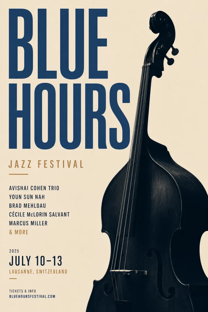
The skill asks for your exact text lines — headline, date, venue, call-to-action — and holds a clear hierarchy: headline first, details after, generous margins throughout. A poster is not a document, though, so if you hand it ten lines it'll push back and suggest trimming. Always proofread the final render; even strong models occasionally slip a character, and it's easier to catch than to explain away later.
Brand consistency across all of them
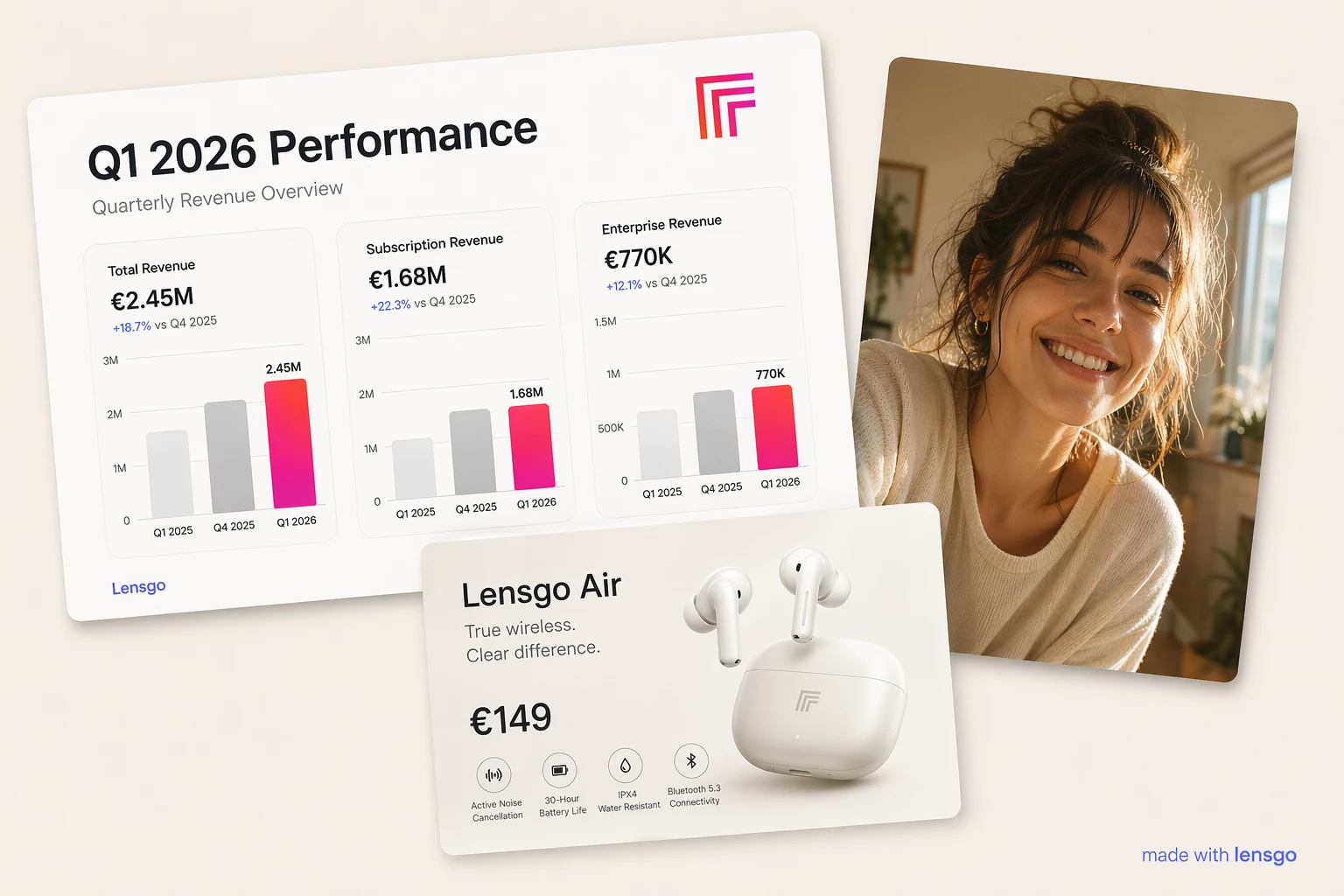
If you've set a brand kit, the design-side skills read it — your colors and tone carry into carousels, posters and campaign sets automatically. The Brand Photoshoot skill leans on this hardest, treating a set of images as one campaign with a shared palette and mood. Set the kit once and every on-brand job starts closer to done.
The pattern
These three skills share a philosophy: encode the rules of the format so you don't have to remember them. Consistency for carousels, glanceable contrast for thumbnails, trustworthy text and hierarchy for posters. You still bring the story, the words, and the taste — the skill handles the craft that's easy to get wrong.
Results vary, so expect to iterate a little, especially on text. Open Iris, pick the skill that matches what you're designing, and brief it in plain language. Iris is in beta; signing up through the Iris page turns on access.